

Showing posts with label Design. Show all posts
Showing posts with label Design. Show all posts
21 December 2011
27 October 2011
Photo Shoot and Website Updates {Design}
I decided it was time to get some professional shots done of myself. I have gotten pretty handy with my point-and-shoot and iPhone, but they don't always look that professional. I contacted the talented Troy Goldthorp and got some shots done. Here is a peak at the shoot:


Once I had the images, I decided it was time to update my branding. I had created the original branding back when I was in second year; I felt that I had outgrown it and needed an update. So I went back to the drawing board and came up with this:


Once I had the images, I decided it was time to update my branding. I had created the original branding back when I was in second year; I felt that I had outgrown it and needed an update. So I went back to the drawing board and came up with this:

You can see more of my website here. My blog also got a makeover to match my website and the new branding (as you can see right now and for the last couple of days).
What do you think of the new branding of my website and blog? Have any comments or suggestions?
07 January 2011
Dream Job {Design}
Sorry for the lack of posts here the last couple of days. I have been enjoying my last few days of freedom before school starts. Today, I want to share with you my current dream job (besides branding for small businesses). My design style is more elegant and polished (think wedding stationary). Martha Stewart has been in the wedding and everyday life areas for many years. The style of her company (and for that matter, her wedding magazine) is very much up my alley. When I was doing my iPad application, I came across a video about the Martha Stewart iPad application. I instantly fell in love and while doing the project, I must have watched this video 50 times!

I decided (just for the heck of it) to look and see what kinds of jobs were at Martha Stewart. That is when I hit gold. I found this job. It's for an interactive designer and if you scroll down, you will see that they actually use the words INFORMATION DESIGN in the job posting.

This is the first time I have ever seen information design actually be put into anything. Most people want a graphic designer or information architect; they want a part of what information design is, but never the whole package. Considering I am still in school (and have another 3 semesters to go) and I would have to move to New York (which would be very cool) I will not be applying for this job any time soon. I an going to keep an eye out and maybe in the future I can have a job like this.

I decided (just for the heck of it) to look and see what kinds of jobs were at Martha Stewart. That is when I hit gold. I found this job. It's for an interactive designer and if you scroll down, you will see that they actually use the words INFORMATION DESIGN in the job posting.
This is the first time I have ever seen information design actually be put into anything. Most people want a graphic designer or information architect; they want a part of what information design is, but never the whole package. Considering I am still in school (and have another 3 semesters to go) and I would have to move to New York (which would be very cool) I will not be applying for this job any time soon. I an going to keep an eye out and maybe in the future I can have a job like this.
05 January 2011
Branding {Design}
I love branding. It is probably my favorite part of design. I love coming up with a logo that suits the business and it's goals. And then theres the identity collaterals (business card, letterhead, envelopes), signage, rack cards, print ads, web site, etc. I would love to work with small businesses and help them with their identity, maybe at a small restaurant or clothing boutique.
Here are a couple of branding/identity assignments I have done for school projects:


Here are a couple of branding/identity assignments I have done for school projects:

The Agrawal Group. This is for a financial company.

Thistle Dew Nicely. This is for a small flower/greeting card shop.
23 December 2010
Exciting News {Design}
You have been very patient (sorry this took so long, there were some blips that needed to be fixed). Here is the big news....
I am proud to introduce to you...
kathleenlangner.com
...my very own personal website!!!

This has been a long time coming; I started thinking about and designing it in the summer and had a friend with a hosting business set it up for me. Just this afternoon in fact. I designed the entire thing. So basically it's designed by me, for me! I. Am. So. Excited!!!
22 December 2010
Stay Tuned...
I have something special and exciting to share with you. Something that has been in the works for a while and hopefully tomorrow I can share it with you!
20 December 2010
Happy Monday! {Design}
A church in the states decided to change up the traditional Christmas carols. They play them on their iPhones and iPads using the apps available. How awesome is that?!?! Check them out here!


14 December 2010
iPad App Design {Design}
Our final project for one of my design classes in school, was to design and iPad application. The topic was based on our infographic posters from the previous project. My topic was exam stress and ways that teens can manage their stress. We had to create the storyboard for the interactions of the application and design 4-7 screens.
I found this project very intricate and detail oriented. There has be be a reason for every element of the design and interactions.


I found this project very intricate and detail oriented. There has be be a reason for every element of the design and interactions.
The icon for the application

The loading screen

An example of what the quiz screens looks like

The home screen

The Body Care page

The Organization page

The Take Breaks page

The Relaxation page
I didn't have the capacity or time to create the final two sections (Sleep and Ask for Help), nor more of the screens for the quiz section.
06 December 2010

01 December 2010
Typface Terrorism {Design}

I saw this and had a good chuckle to myself. Do we really need fonts like comic sans and papyrus in the world, when we have such great ones like helvetica?
30 November 2010
My Two Loves {Design}
Being the tea lover that I am, I got my morning tea from Good Earth this morning. I headed off to class, drinking my tea. I don't know what made me look at the tea bag tag, but when I did, I saw some things that were really good information design. Firstly, the string of the tea bag is stitched and knotted, so that the tea doesn't drip off from it. Also, on the actual tag itself, they tell you how long to steep the tea (4 minutes). I have drank a lot of tea in my day, but never knew how long to steep it. Problem Solved!


29 November 2010
Exam Stress Infographic {Design}
In class we had to create an infographic poster for high school students. I chose "Ways to Manage Exam Stress."

Short Rationale
The main purpose of this project was to create a poster that depicts a certain topic
relevant to Calgary high school students, while at the same time, keep a balance between typographic and graphical elements. Overall, the design decisions are as follows: I chose two fonts, Myriad Pro for the “body” text and Designer Notes for the title, headings and other “supplementary” material. I chose to use illustrative images to enhance the light hearted feel of the poster. The colors are bright enough to attract attention, yet muted enough to still be calming. The circle you see in the middle of the poster, serves two purposes: 1) a color legend and 2) representing the process of managing stress. Finally, the layout of the different elements creates continuity and flow of the poster. Overall, the typography, images, grid and layout of a poster have to work together to create a piece that will be successful in educating high school students on ways to manage their exam stress.
Our next assignment, is to create an iPad app based on this topic. Stay Tuned!

(sorry it's kind of hard to read, but you get the jist!)
Short Rationale
The main purpose of this project was to create a poster that depicts a certain topic
relevant to Calgary high school students, while at the same time, keep a balance between typographic and graphical elements. Overall, the design decisions are as follows: I chose two fonts, Myriad Pro for the “body” text and Designer Notes for the title, headings and other “supplementary” material. I chose to use illustrative images to enhance the light hearted feel of the poster. The colors are bright enough to attract attention, yet muted enough to still be calming. The circle you see in the middle of the poster, serves two purposes: 1) a color legend and 2) representing the process of managing stress. Finally, the layout of the different elements creates continuity and flow of the poster. Overall, the typography, images, grid and layout of a poster have to work together to create a piece that will be successful in educating high school students on ways to manage their exam stress.
Our next assignment, is to create an iPad app based on this topic. Stay Tuned!
16 September 2010
Healthy Lunch Display {Design}
This is a freelance project I worked on over the summer (I know, it has taken me a while to post it). It is a healthy lunch display for a public health clinic. Pretty self explanatory!


02 September 2010
Blog Header {Design}


13 July 2010
What Is Information Design? {Design}
When I tell people that I am an Information Designer or that I’m taking Information Design in school, I usually get a blank stare. I try to follow it up quickly by saying that it’s a combination of graphic design, information architecture and web development. That’s okay to tell people quickly, but it’s not 100% accurate; it’s much more than that. It also takes complex information and makes it simple and clear of the user. Usability is another big part of Information Design is usability; the ease at which people can use a tool in order to achieve a particular goal.
The top roles of an Information Designer:
Designer.
Being able to come up with an original and unique idea from nothing and creating materials and documents (print or digital) that are attractive and readable.
Information Architect.
Developing the information makeup of a web site (wire frames) and creating a good user experience from that structure.
Technical Writer.
Having strong rhetoric and writing skills and being able to write documents for a variety of fields and topics.
Web Developer.
Developing beautiful and functional websites for the internet.
Programmer.
Being able to write and understand the coding.
Project Manager.
The person accountable for the accomplishing of a certain project, through the planning, execution, and closing.
Overall, creativity is a must; any one of these jobs requires you to have an open mind, be imaginative and original.
The neat thing is that all these roles fit together and interact when working on a project. Take the development or redesign of a web site, for example. The project manager is in charge of it all; they keep the project going through the ups and downs. Then comes the information architect; they develop the foundation for the website, by making the wire frames. The designer takes those wire frames and creates the individual pages of the website. Meanwhile, the writer (technical, or not) takes the wire frames and writes the copy for the website. The designers will insert the copy into the pages. Then programmers and web developers take the designed pages and wire frames and put it all together. They link all the pages and add functionality to the buttons (call to actions), as well as the more complicated back end parts of the web site. Together, they all work together to create a attractive and functional web site.
Being an Information Designer and having knowledge on all of these roles, makes it easier to see where other areas are coming from and understand what they are taking about. I am technically an information architect intern, but I work with designers, web developers, project managers, etc. on a daily basis, but I also have firsthand experience with what they do and how they do it. I have found this ability to be very helpful in my internship.
13 May 2010
Helmet Safety II {Design}
So here it is! The finished design for the helmet safety campaign.
So we have the banner for the top of the tri-fold. I used the colors from the brochure I was given. I kept it simple and bright.

And I also designed the information/questions blocks as well. I used bright happy colors and kept the design and images to a minimum. I couldn't edit the actual information (it was all pretty important).

I used the colors from the pamphlet that the client (my mom and her colleagues) gave me.

Think Book {Design}
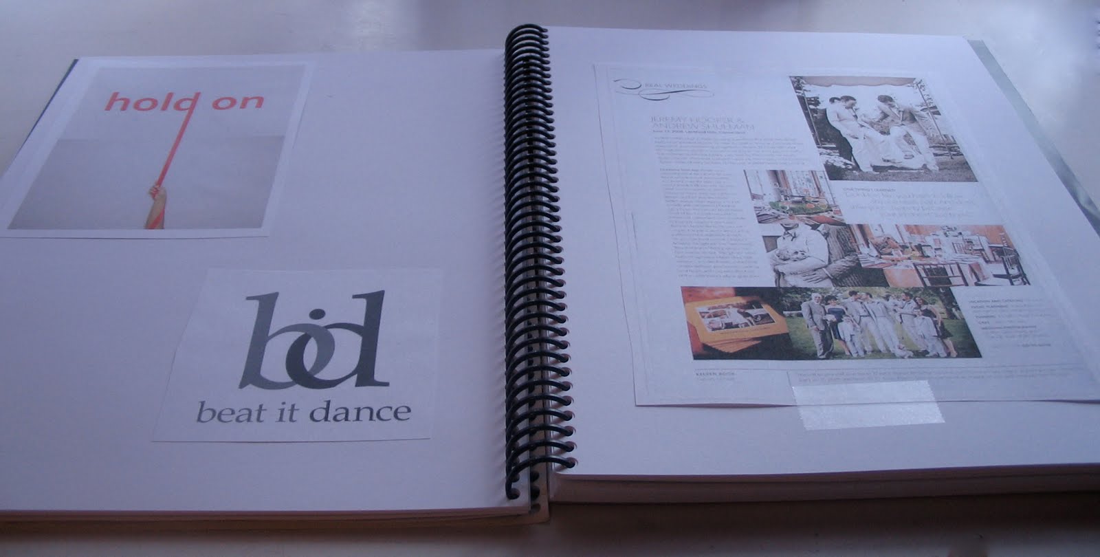
I created this book about a year ago. It has ideas and inspirations for business cards, greeting cards, brochures and pamphlets, logos/branding and some other inspirations. I look at this book when I feel my creativity is running low for a design project. I also look at some of my design books, too. Usually, I can get some inspiration from one of those.


Most of the time, I think up my own ideas. Usually when I am in the shower, randomly enough. I need these Aqua Notes:

It's a pad of paper with a pen that works in the wetness of the shower! Pretty cool, if you ask me.
Subscribe to:
Posts (Atom)